
Adaptive Virtual Gallery
Dev Tool | Unity (C#)
Target Platform | Microsoft Mesh
Our team was looking for a way to set our VR gallery apart from a traditional gallery experience.
I took this opportunity to improve two aspects:
Digital artwork supported in VR settings usually have resolution limits. Moving too close to a digital image can reveal pixelation.
Reading artwork labels with small fonts is not a comfortable experience.
Client
Accenture
MY Role
Interaction design
Iterative prototyping
Starting Point
This is a static artwork.
When the user is close, pixelations show, especially when the image is a lower resolution file.
Static vs. Adaptive
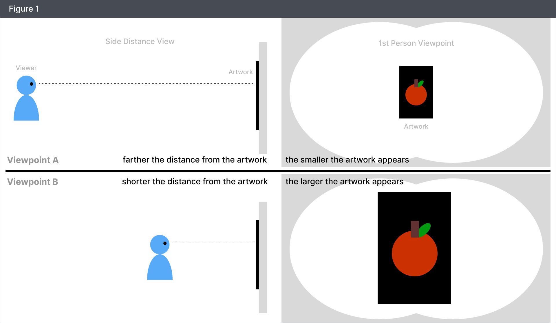
Our starting point is what a viewer experiences in real life.
When one moves closer to an artwork, the art becomes bigger and details appear.
This is a static artwork.
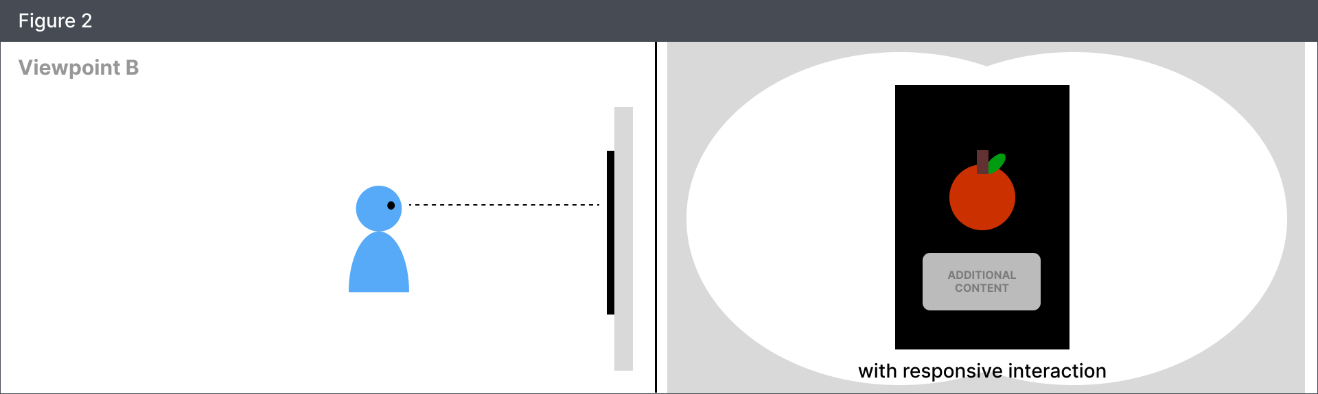
For our purposes, I explored the idea of an adaptive artwork. (Similar to LODs in gaming)
Can we set up an artwork so that its size would stay almost uniform when seen from any distance, and show more content when viewers are close?
Prototyping
Iteration 1
Smooth Distance Based Resize
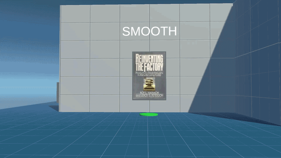
This test shows the image resizing based on how far the viewer is from the image.
🟢 The effect prevented viewers from seeing pixelation in the image.
🔴Some testers felt as if the image was being elusive, moving away from them.
🔴Some testers experienced mild motion sickness.
💡IDEAS
Try a stepped approach to alleviate motion sickness.
Users want more detail when they approach something. Try an additive approach.
Iteration 2
Stepped Distance Based Resize
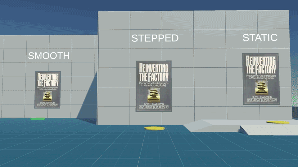
We tried a stepped approach to see if it could alleviate motion sickness.
🟢 Testers expressed that this iteration felt more stable.
💭INSIGHT In responsive sizing, stepped animations are more stable than smooth ongoing animations.
Iteration 3
Poster Swap
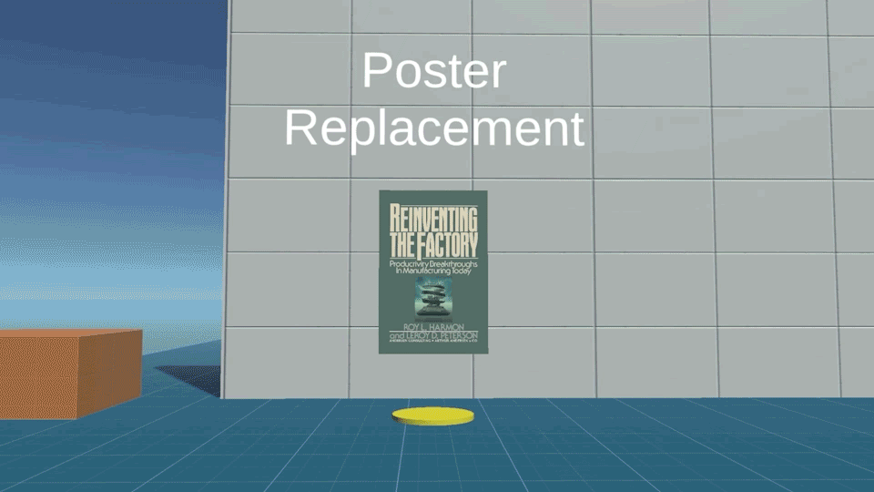
🟢The simplicity is clean
🔴Viewers had to look up and down instead of sideways (horizontal head movement is less straining)
🔴The effect did not fully remedy the fact that we are taking away information (image size) as the user approaches the image.
💭INSIGHT A single step transition is less distracting than multi-stepped transitions.
💡IDEA
Make the image and text legible within the user’s horizontal viewscape.
Final Iteration
Anchored Image + Popup
We landed at this effect combining the previous explorations.
🟢I kept the main image and blurred it out so that it stays to act as a visual anchor.
🟢Then I added in an animated popup with a smaller image that users can look closely at, in addition to a text box for descriptions.
🟢These elements were spread out horizontally so that the user could easily intake information without any vertical head movement.
This effect checked all the boxes for the type of interactivity that the team was looking for😊🎉

