
Key Concepts Activity
Target Platform | Quest 2
DEV TOOL | Unity
Accenture developed a VR experience to help employees learn core technology concepts. However, learners were struggling to complete a checkpoint called the "Key Concepts" activity.
I was brought in to identify the issue and improve the learning experience. After analyzing learner feedback, I came up with a plan to simplify user interaction and add clear sensory feedback.
With the updated release, we more than doubled the activity completion rate to 92%
CLIENT
Accenture
MY ROLE
UX Design
Interaction Design
TEAM
DEVELOPER
JORDAN SAVAGE
PROJECT MANAGER
LISA RIETHER
The Original Experience
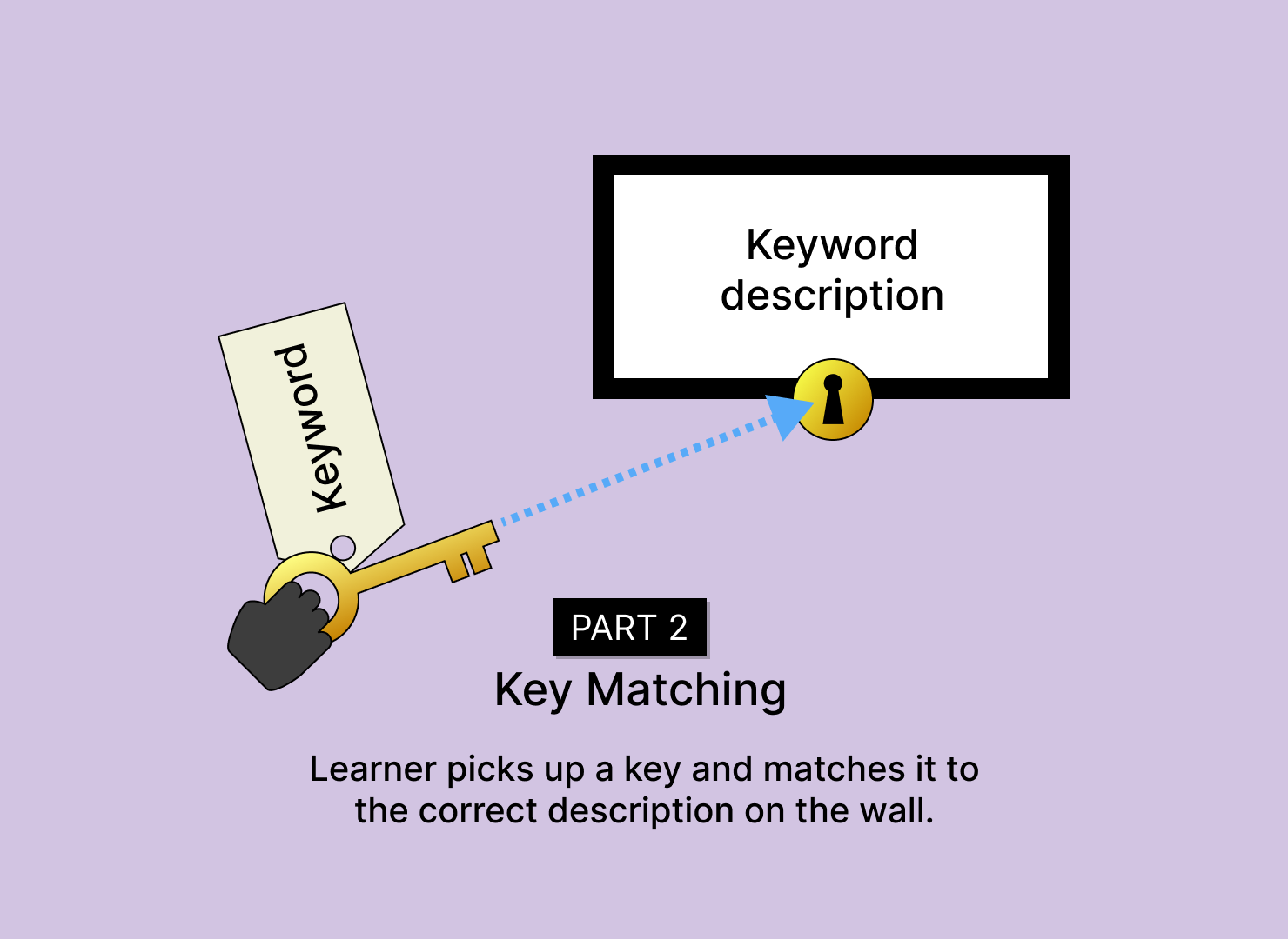
The original experience was divided into two parts: key collection and key matching.


Feedback First
Our PM had collected crucial learner feedback from rounds of testing. I analyzed this data and categorized items to identify common pain points.
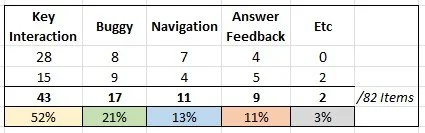
There were four main issue groups: key interaction, “just buggy”, navigation, and answer feedback. The biggest issue was with key interaction.

Common Voices
1. Complex key manipulation /
answer submission process (52%)
“sometimes seems you didn't select the right one, but really what you're doing wrong is the way to use the key in the wall.”
“Some of the handling required some patience and dexterity, especially getting the keys in the locks.”
2. Difficulty with collecting keys / space navigation (13%)
“Need the ability to turn around, especially in the cafe when trying to track down all of the keys to put into the wall” – seated issue
“I didn’t know I could teleport to a different place in the room so took me a minute to understand how to get through it.”
3. Answer feedback unclear (11%)
“frustrated as keys would go into the lock and stay but they were RED, which at first I did not realize was wrong. There was not real feedback on that game to provide additional information once a key fit and turned green.”
“did not understand if the wrong answers are selected. “
Proposed Changes
Focused Activity
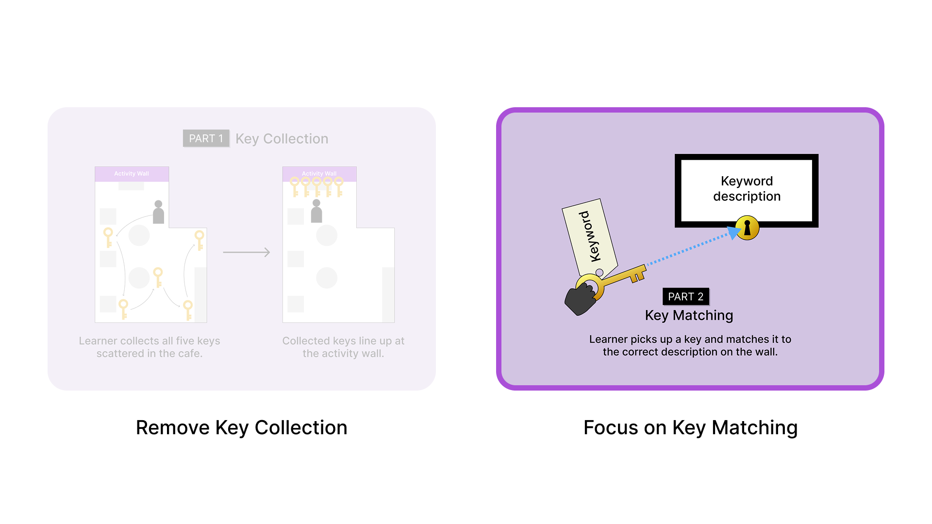
First, we removed the initial key collection part of the activity. It didn’t have a strong learning purpose and added interaction complexity.
This helped shrink the entire activity zone to a single wall, where learners could focus on key matching.

Activity Zone - Before

Activity Zone - After
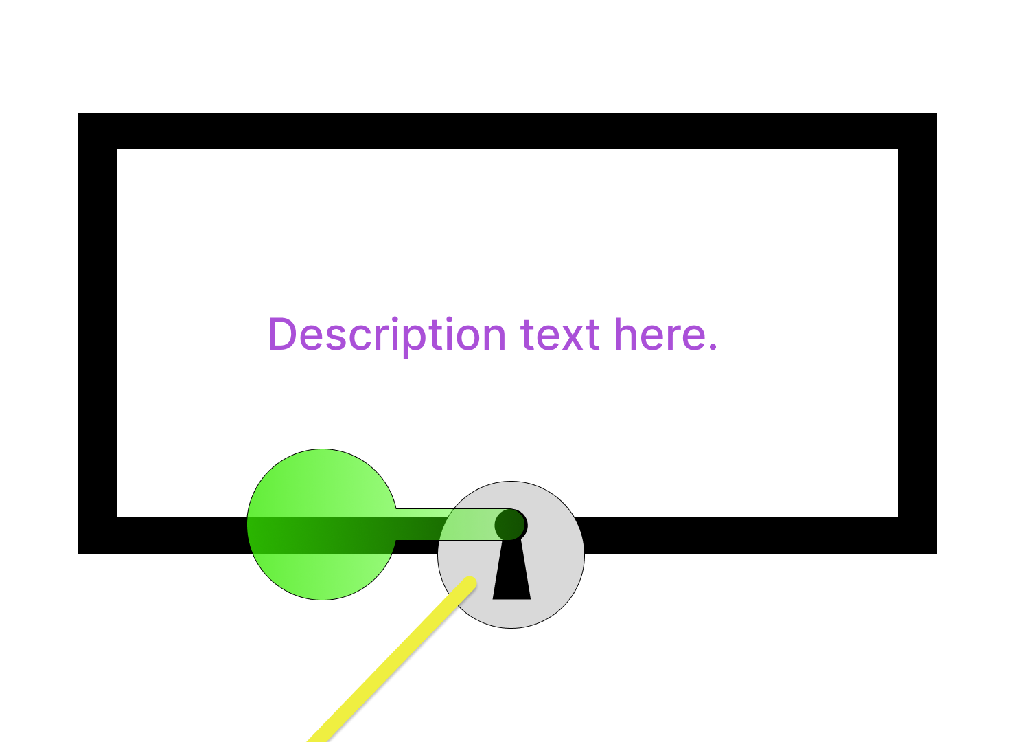
2. Clear and Easy Interactions
In VR, many users are new to controllers and don’t have the same dexterity that they would have in real life.
We needed to make interactions easy and clear.

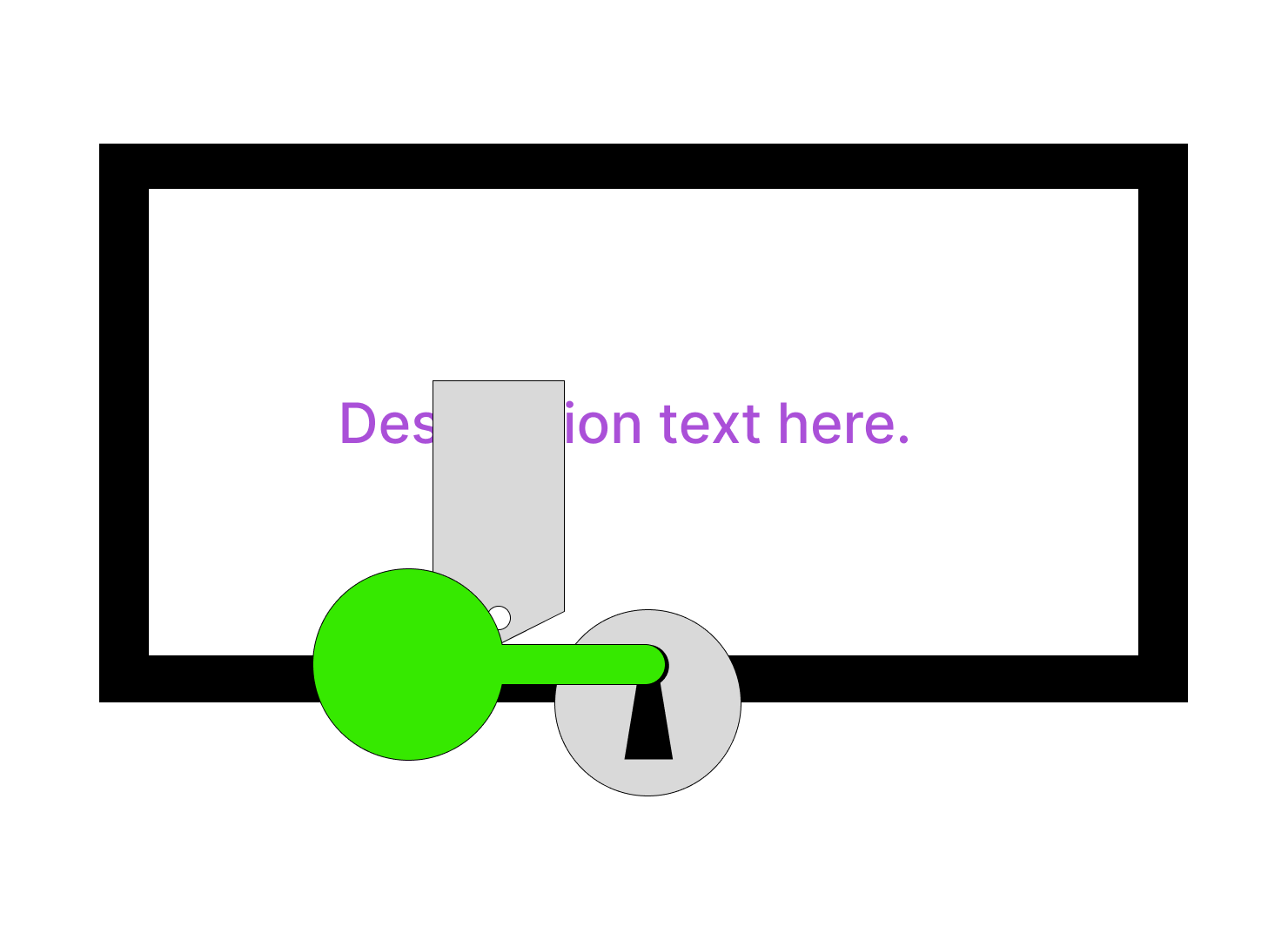
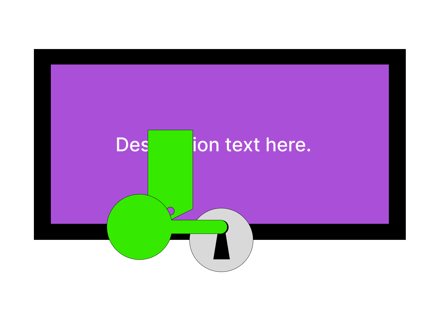
[BEFORE]
Submission area was limited to the keyhole.
[AFTER]
Submission area includes the entire frame.
[BEFORE]
On submission area hover :
a key insert animation appeared on the keyhole.

[AFTER]
On submission area hover:
the entire frame is highlighted.
Key Match Interaction Flow

We streamlined key manipulation by letting learners submit answers with the trigger button.
It's easier on the hands than having to move the joystick while pressing the grab button.
3. Layered Feedback
We added on layers of visual and auditory feedback to prevent
learners getting lost while interacting with the keys and answers on the wall.

[BEFORE]
When the key was sent to an incorrect answer:
An error sound effect played. A red key briefly appeared at the keyhole. Then the key returned to it’s standby location.

[AFTER]
When the key is sent to an incorrect answer:
an error sound effect plays. The entire frame flashes red. Key remains on hand for re-submission elsewhere.
[BEFORE]
When the key was sent to it’s matching answer:
A correct answer sound effect played. The key was inserted into the keyhole and turned green.
[AFTER]
When key is sent to it’s matching answer:
A correct answer sound effect plays. The key is inserted into the keyhole and turns green, along with it’s label. Text on the frame turns white with a purple background.

[BEFORE]
The wall setup: There were five description frames and some art on the wall. A table stood in front of the wall.

[AFTER]
The wall setup: We removed the table and added a progress bar frame that updates as the keys are matched. We placed an answer submission guide directly on the wall for quick access.
Update Summary
1. Focused Activity
Addressed: Difficulty with collecting keys / space navigation (13%)
Removed key collection
2. Clear and Easy Interactions
Addressed: Complex key manipulation / answer submission process (52%)
Expanded answer submission area
Added frame highlight on hover
Reduced interaction steps for answer submission
3. Layered Feedback
Addressed: Answer feedback unclear (11%)
Added visual feedback for wrong answer submission
Added visual feedback for correct answer submission
Added an activity guide on the wall
Added a progress tracker on the wall
Updated Experience
Outcomes
Activity completion rate reached 92%
The activity was no longer a bottleneck,
which helped users complete the full VR experience.